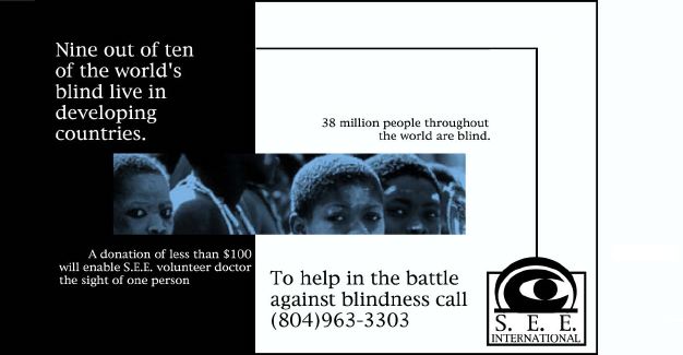
This was the color ad for the S.E.E. International corporate identity package. I combined the picture with the statistics of blindness around the world to emphasis this worldwide problem. Also, the use of the shade of blue is used on all graphics throughout the package and it stems from the idea of medical blue and blue being a soothing color, rather than the danger associated with red. I also used various eyes throughout the package to engage the viewer based on the fact that eyes are visually interesting and the nature of the organizations work with sight.